Keto.com.au is one of Australia's leading keto supplement brands.
A brand built on commitment to the journey
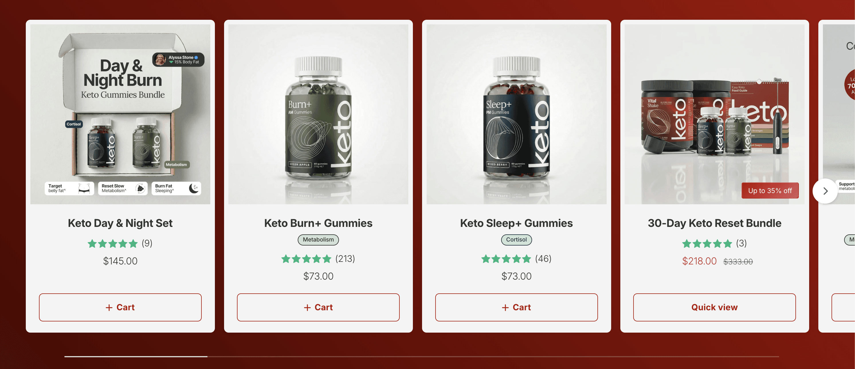
Keto.com.au is one of Australia's leading keto supplement brands. Their flagship product, the Burn+ gummy, is designed for customers who are in it for the long haul — real results require real consistency, and real consistency means buying in bulk.
That makes the purchase moment critical. A customer who buys once and runs out after four weeks is much less valuable than one who commits to a three-month supply from day one. The challenge was converting that logic into a seamless on-page experience that felt helpful, not pushy.
One product, three very different buying decisions
Keto's catalog is tightly focused, but their customers arrive at very different levels of intent. Some are first-timers testing the waters. Others are returning buyers ready to stock up. The product page needed to serve all of them — without a complicated UX or a diluted value proposition.
They needed a way to:
Surface multi-unit offers without cluttering the page or building a custom variant selector from scratch
Communicate real per-unit savings in a way that shifts the frame from "how much am I spending" to "how much am I saving"
Create urgency that felt genuine — not gimmicky — to prompt a decision without friction
A/B test different offer structures continuously, without needing a developer for every experiment
A bundle selector built around how customers actually think
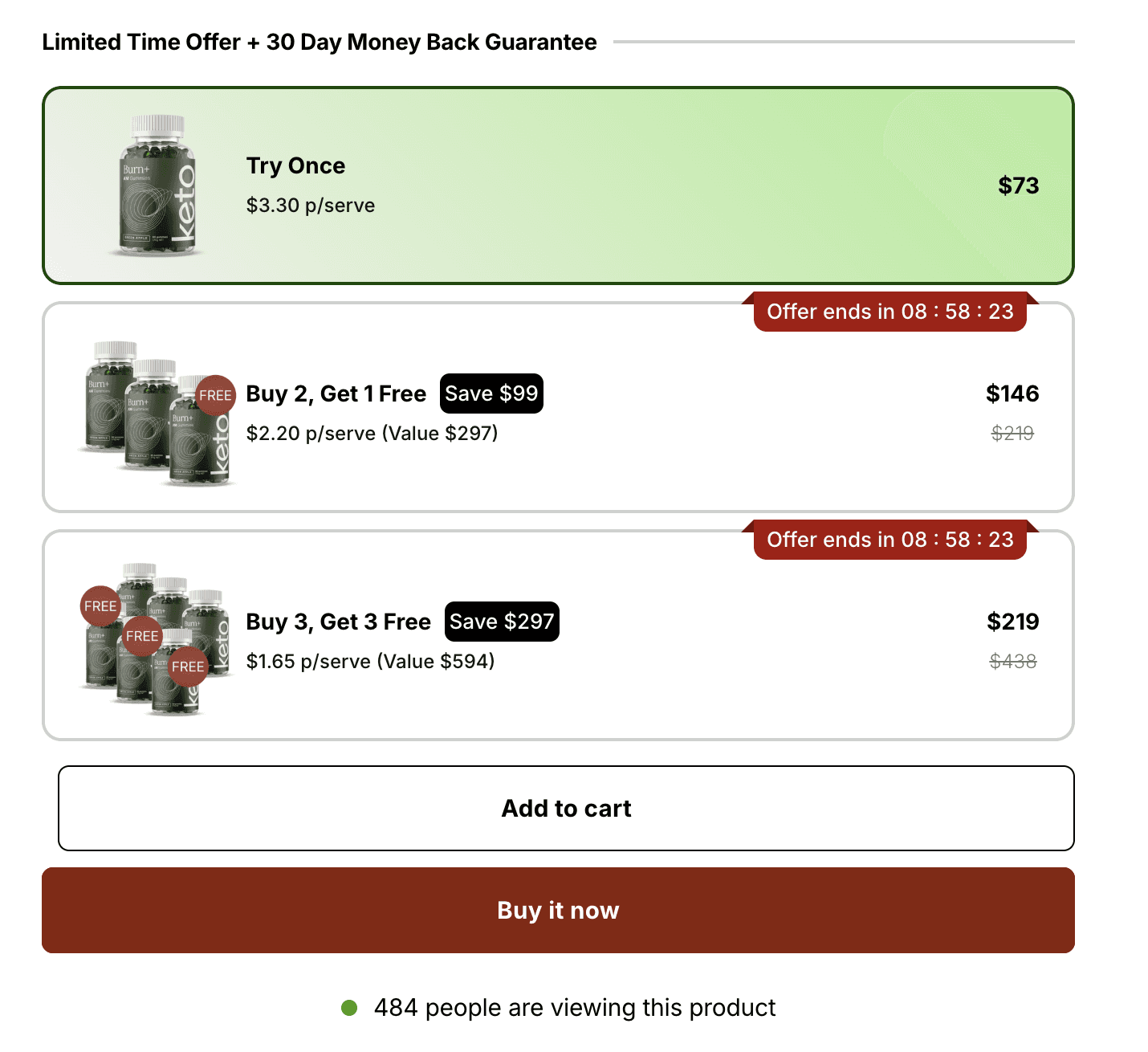
Rapi Bundle gave Keto the infrastructure to build a multi-tier volume offer directly on the product page — structured around three distinct buying modes.
The plays
1- Per-unit price anchoring
Every bundle tier shows cost per serve — not just total price. Moving from $3.30 to $1.65 per serve reframes the decision entirely. Customers stop comparing absolute spend and start comparing value. The math does the selling.
2- Countdown timer on the bundle offers
The Buy 2/Get 1 and Buy 3/Get 3 tiers each carry a live countdown timer. The entry tier (Try Once) has none — it's always available. Urgency is reserved for the offers worth acting on fast, making the timer feel earned rather than manufactured.
3- Live social proof below the selector
A live viewer count ("586 people are viewing this product") runs below the buy buttons. Combined with the timer, it signals real demand — particularly effective for a mid-range supplement buy where hesitation is common.
4- A/B testing across offer structures
Rather than committing to a single bundle layout, Keto runs continuous tests across different offer combinations, savings framing ($ vs %), CTA copy, and timer durations. Rapi Bundle's built-in A/B testing lets them track uptake per variant without a dev dependency.
+$450,000 in extra revenue in 5 months
With the bundle selector live, the majority of Keto's buyers no longer default to the single-bottle entry option. The multi-unit tiers — framed by per-serve pricing and time-limited offers — consistently pull a meaningful share of customers toward the 3-bottle and 6-bottle bundles.
The per-serve framing is especially effective at making the top-tier bundle feel like the logical choice — not a splurge. A customer spending $219 for six months of supply is paying less per day than a daily coffee. That mental shift happens at the bundle selector, before they ever reach the cart.
The timer adds the final layer: it converts a good deal into a decision that needs to happen now. Because the entry-tier has no timer, the urgency lands as genuine — reserved for offers that are actually time-sensitive.
The takeaway
You don't need a complex catalog to run a high-performing bundle program. You need the right framing, the right urgency, and the right data to keep improving. For Keto, the product page is where a one-time buyer becomes a three-month customer — and Rapi Bundle is what makes that moment work.


